Company rebrand applied to a new private label product line, including updated logo, color palette, and typography. Developed a color variation system in collaboration with the product manager. Partnered with a photographer to create imagery for print and web.
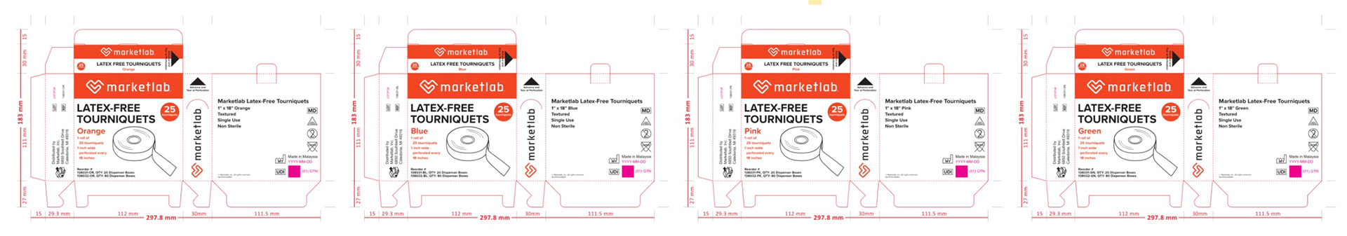
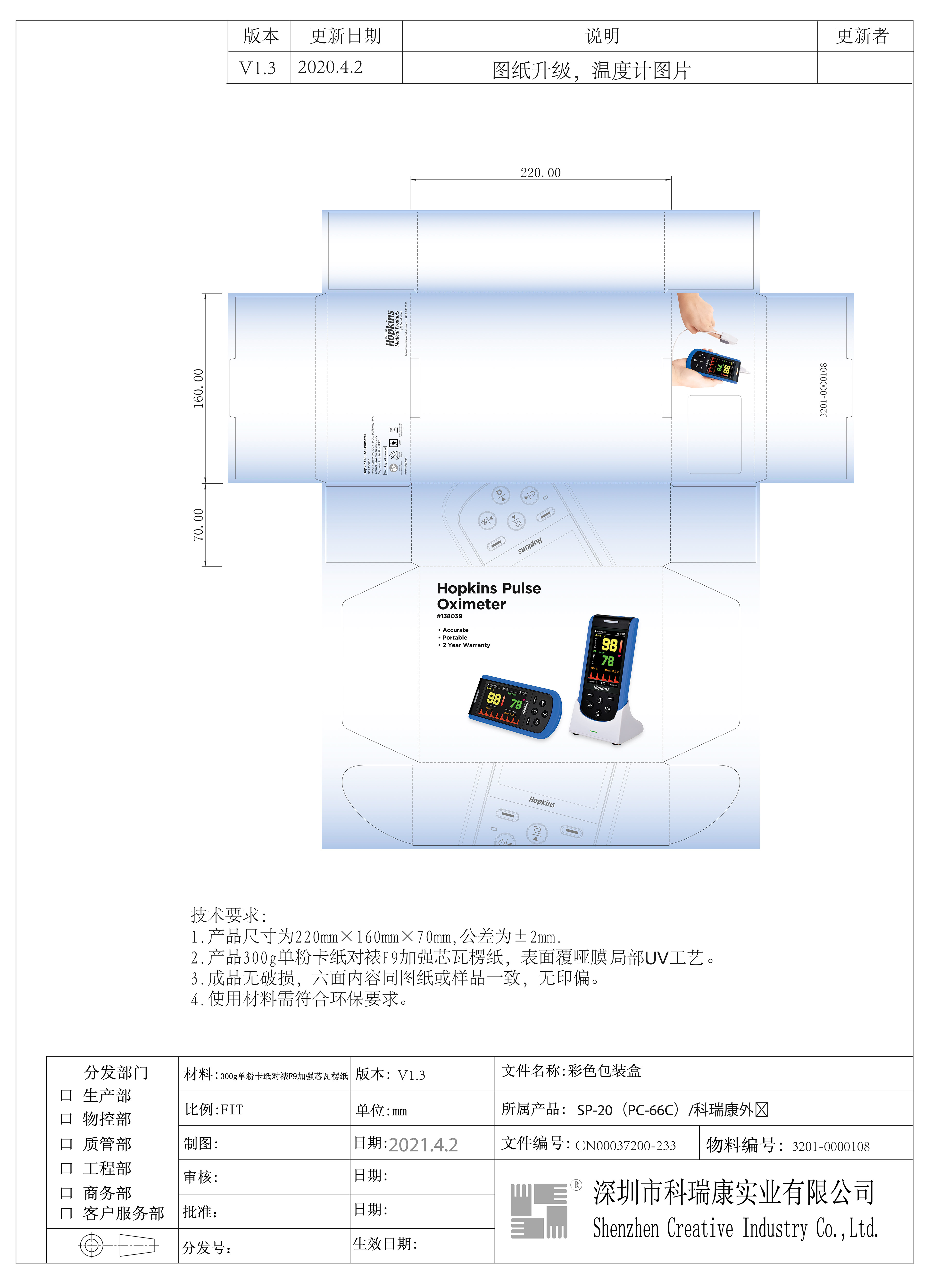
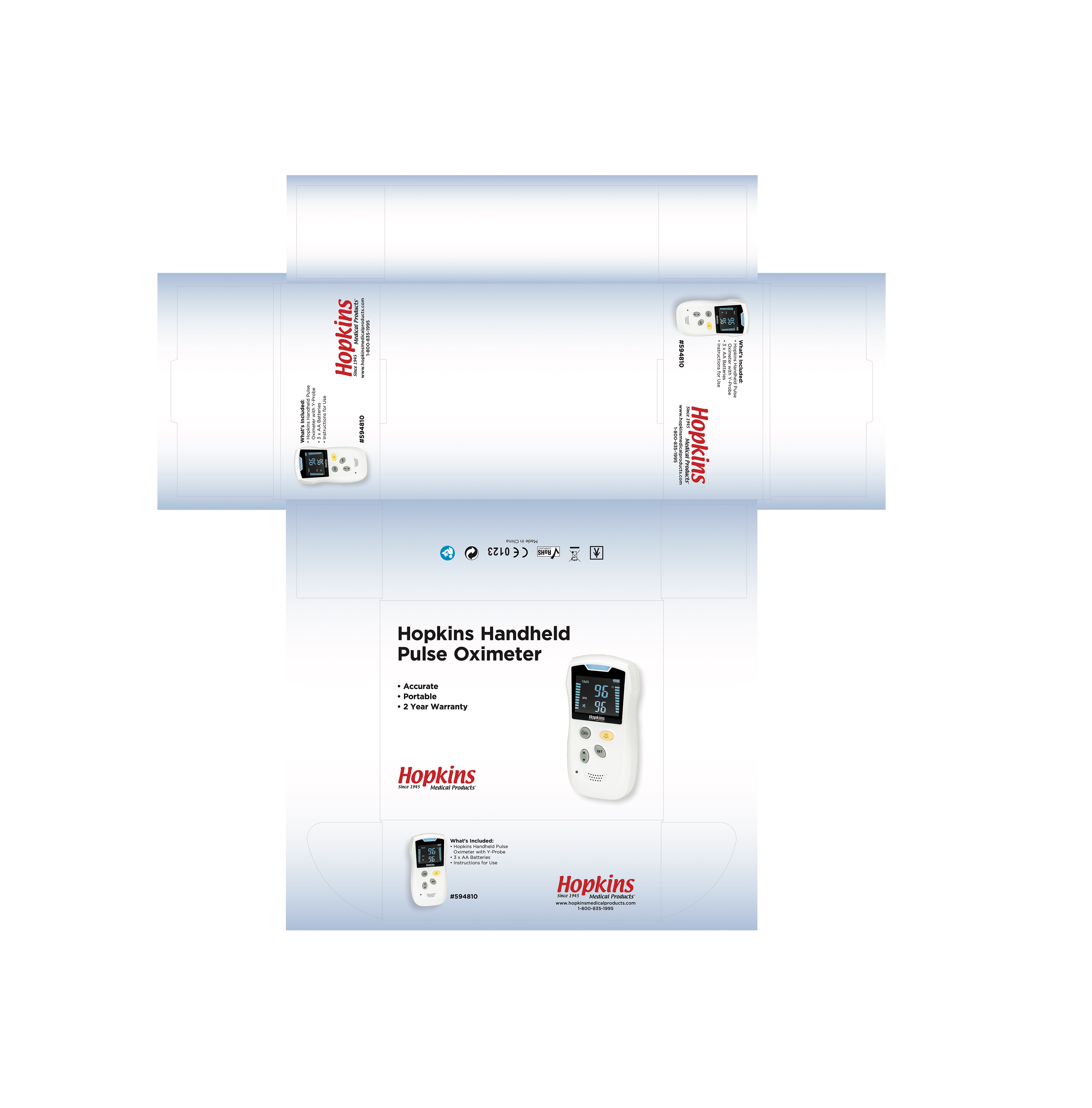
Standardized packaging dielines across the product line to ensure consistency, clarity, and functionality. Incorporated ISO symbols to support compliance and usability.
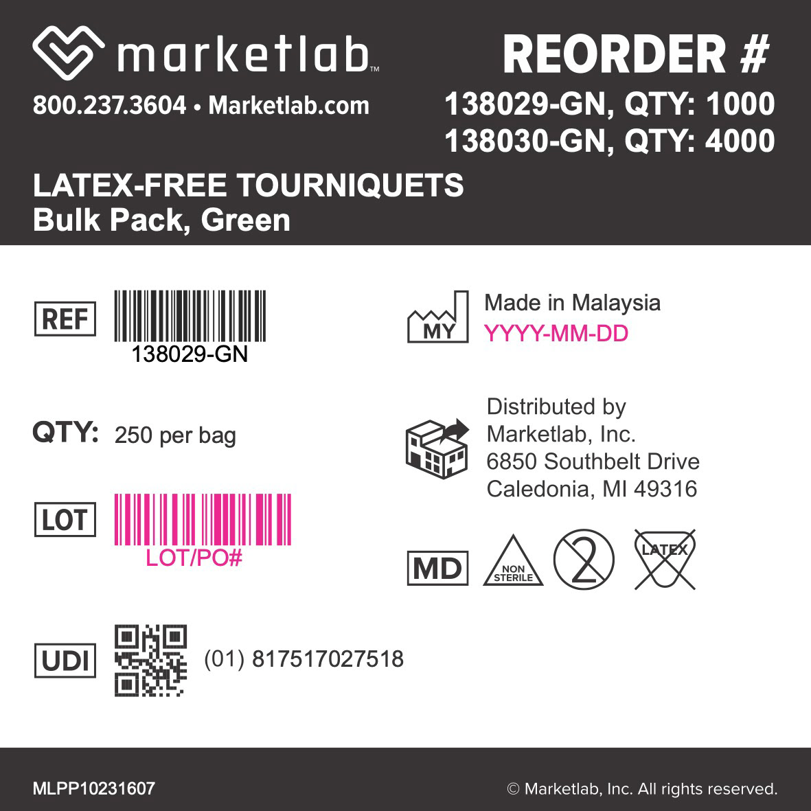
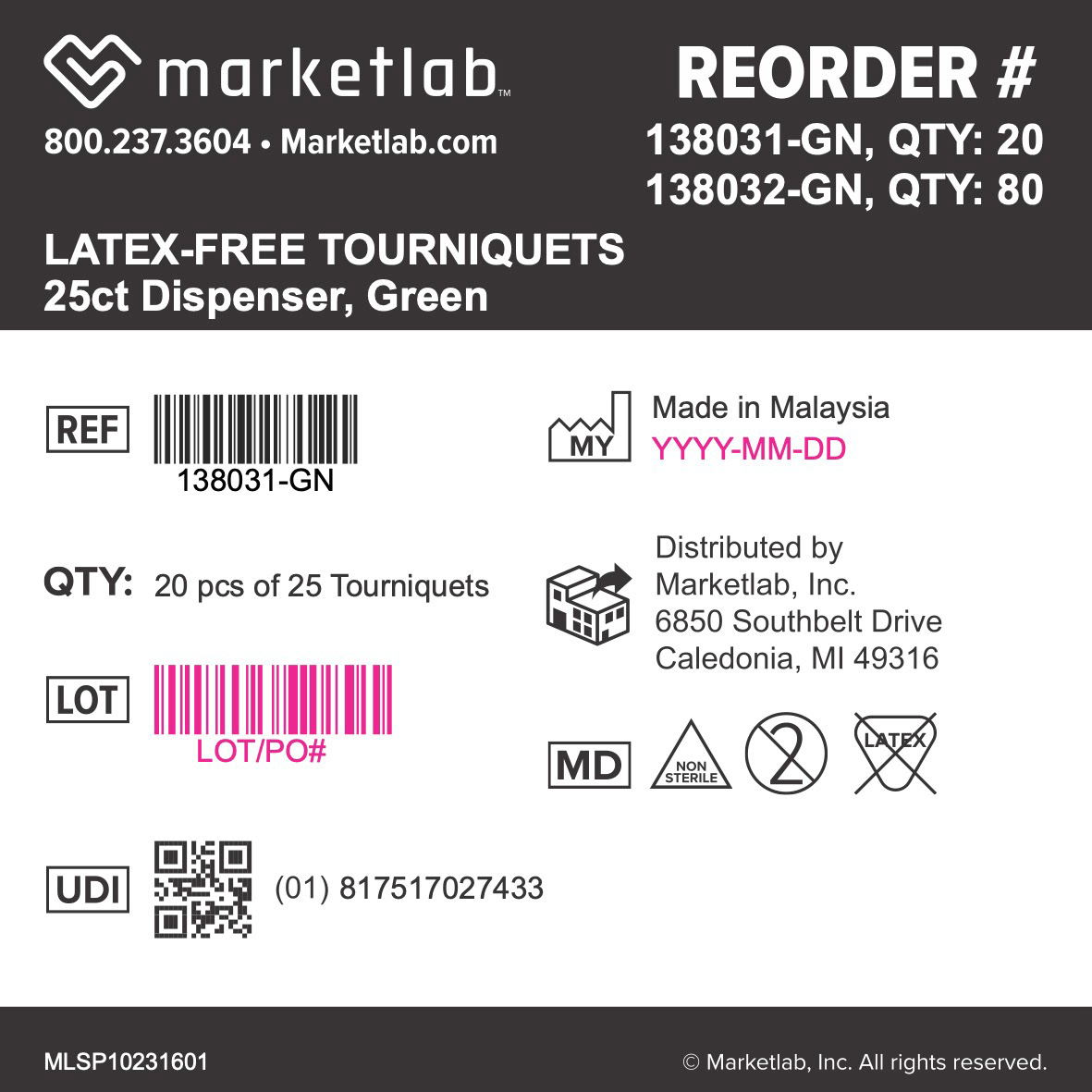
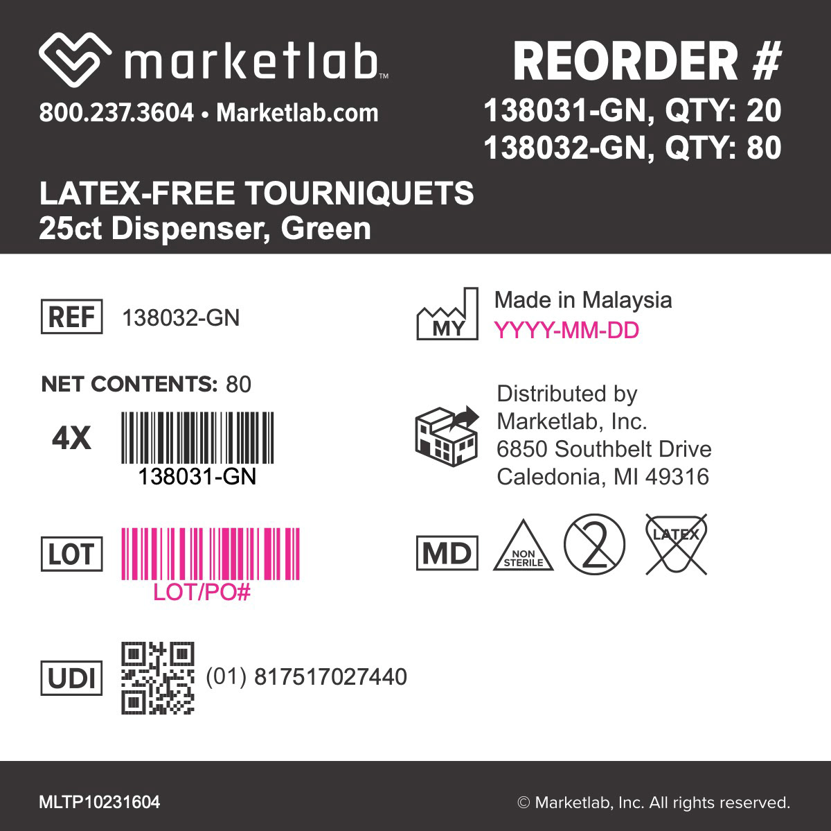
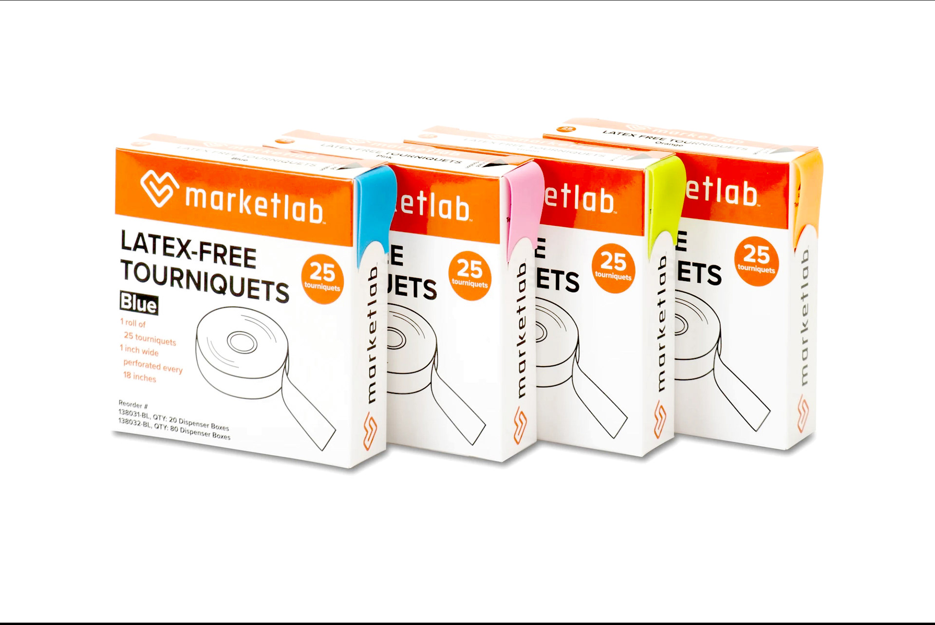
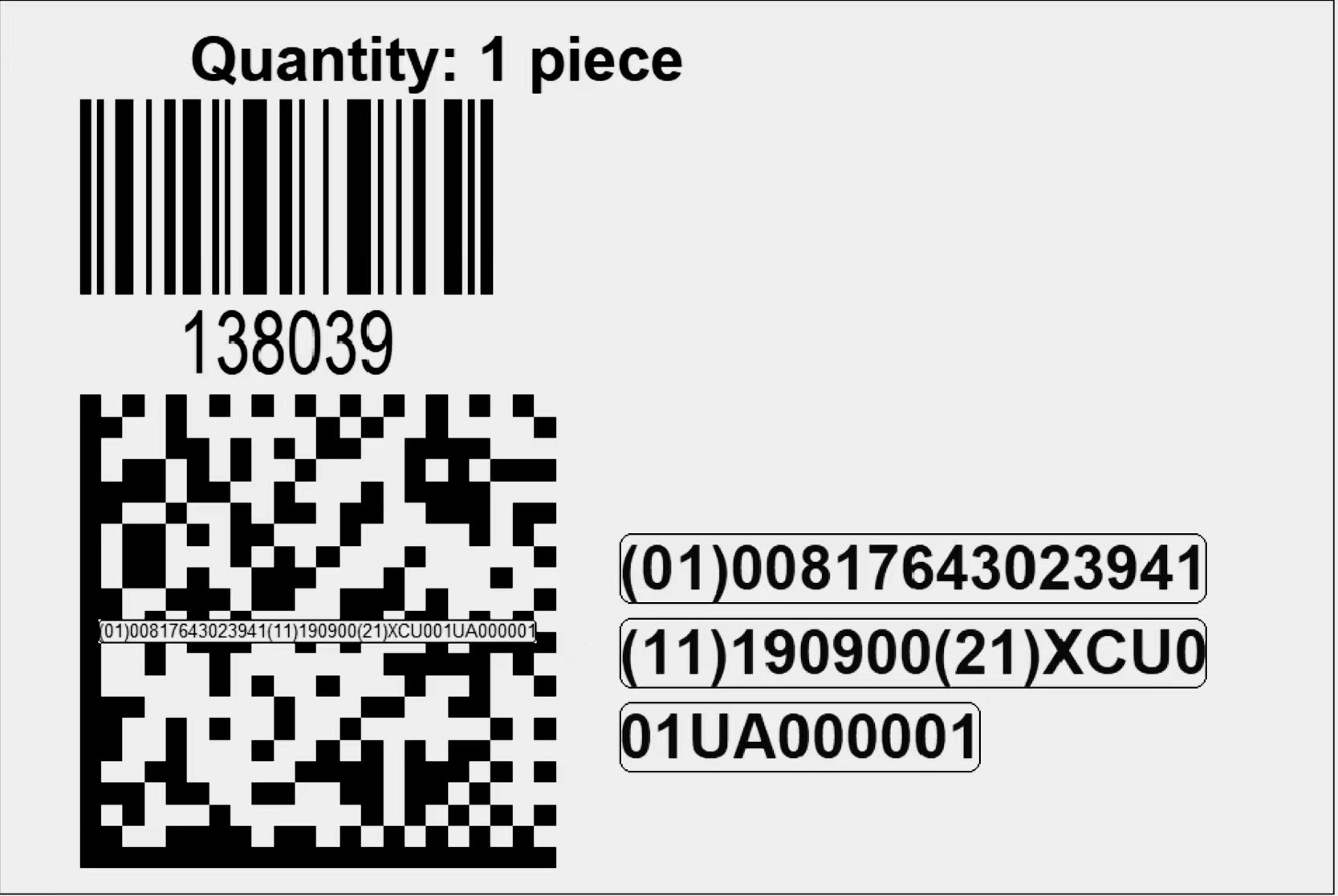
Developed a tiered labeling system across Primary, Secondary, and Tertiary packaging, covering product labels, outer shippers, and mailing labels. Used magenta to designate variable content for manufacturing and warehouse workflows.
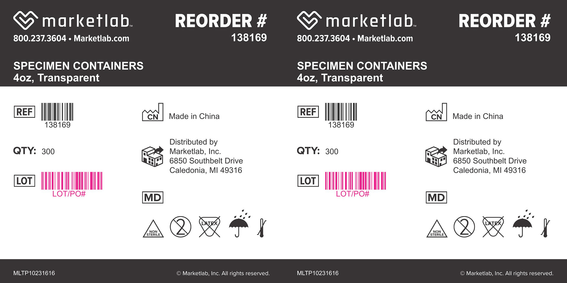
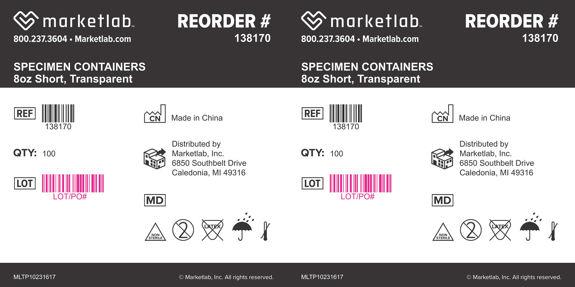
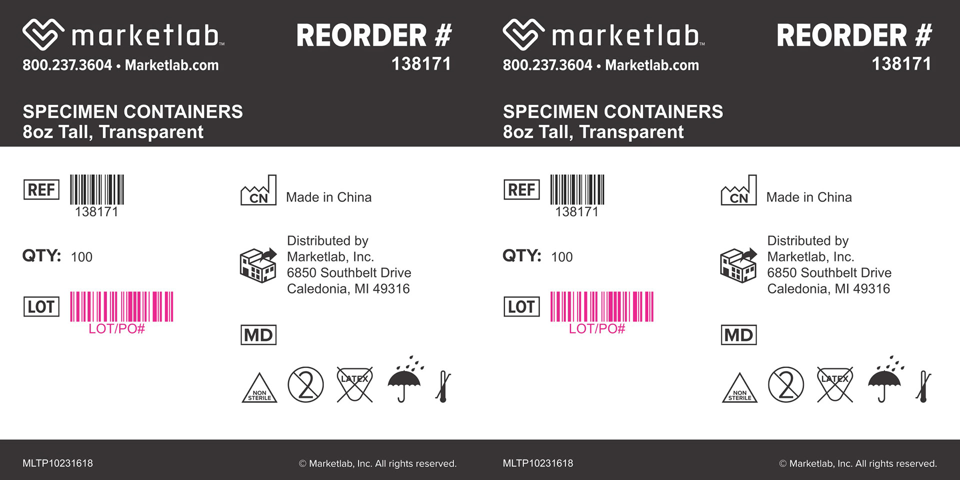
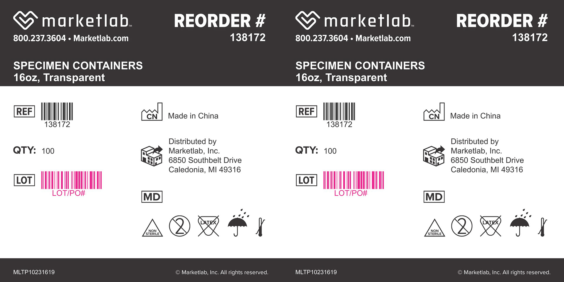
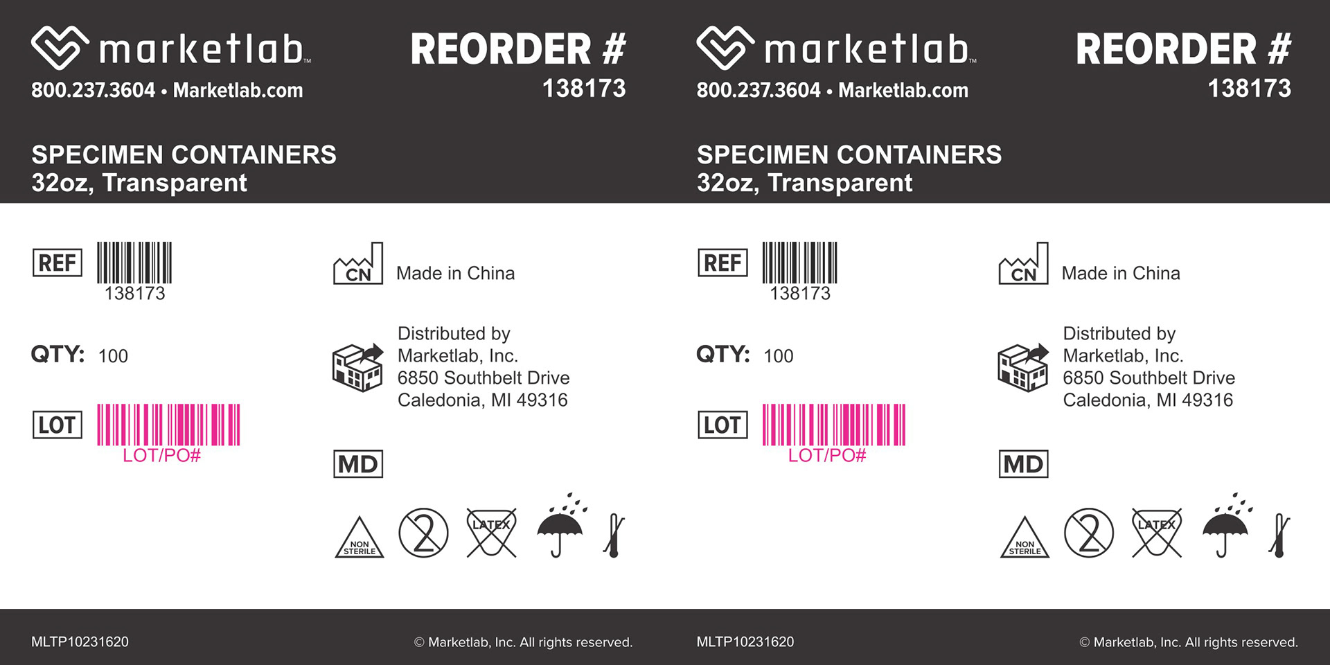


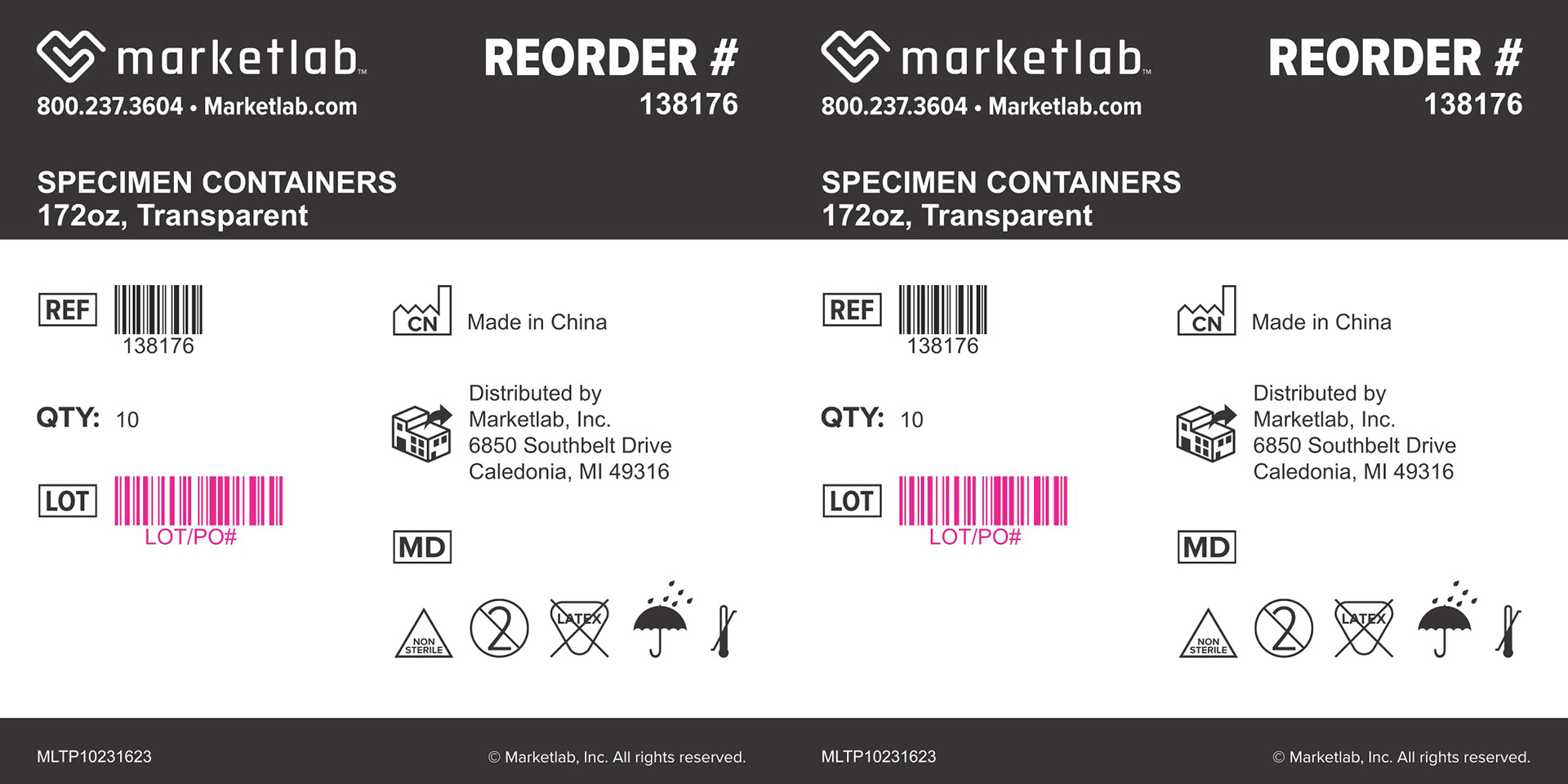
Corner-wrap product labels designed to adhere across box edges. Built 2-up to wrap cleanly along both sides. Shown across multiple specimen cup sizes.
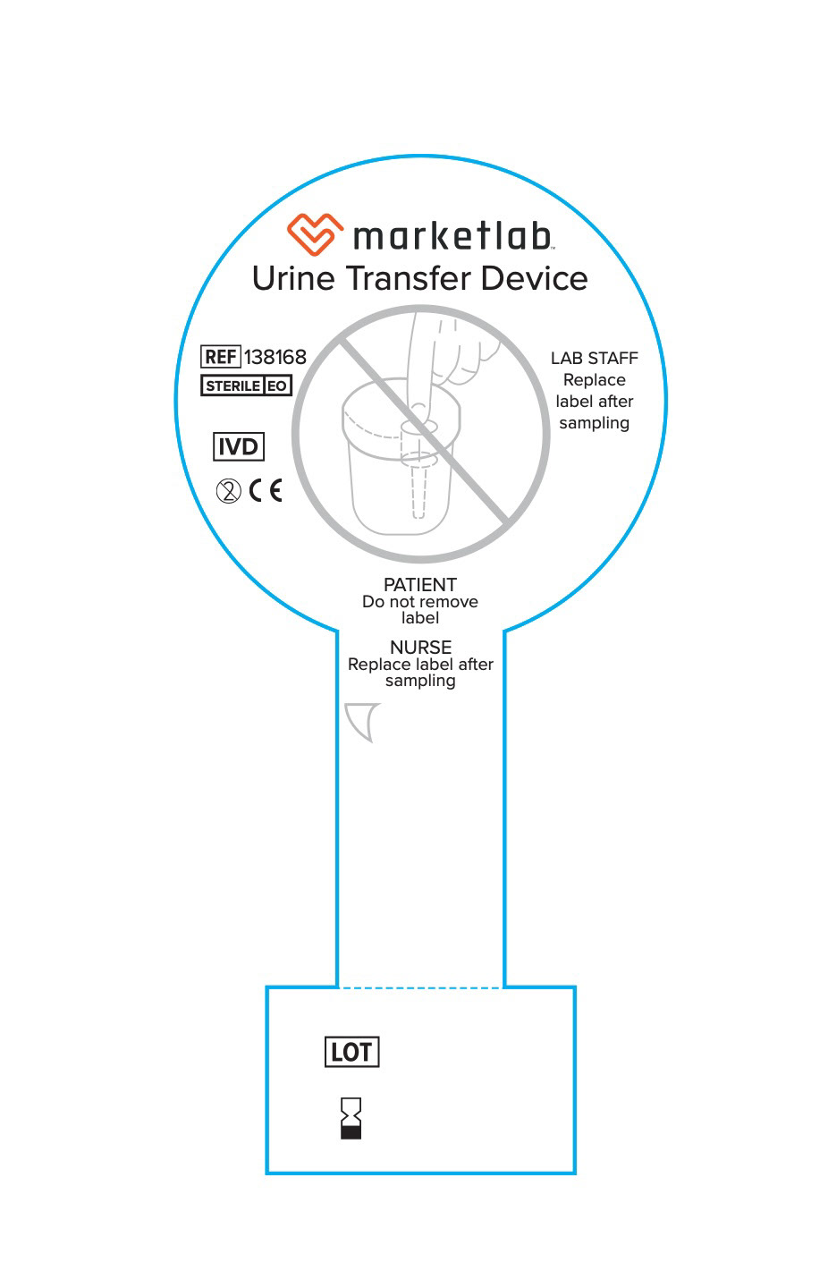
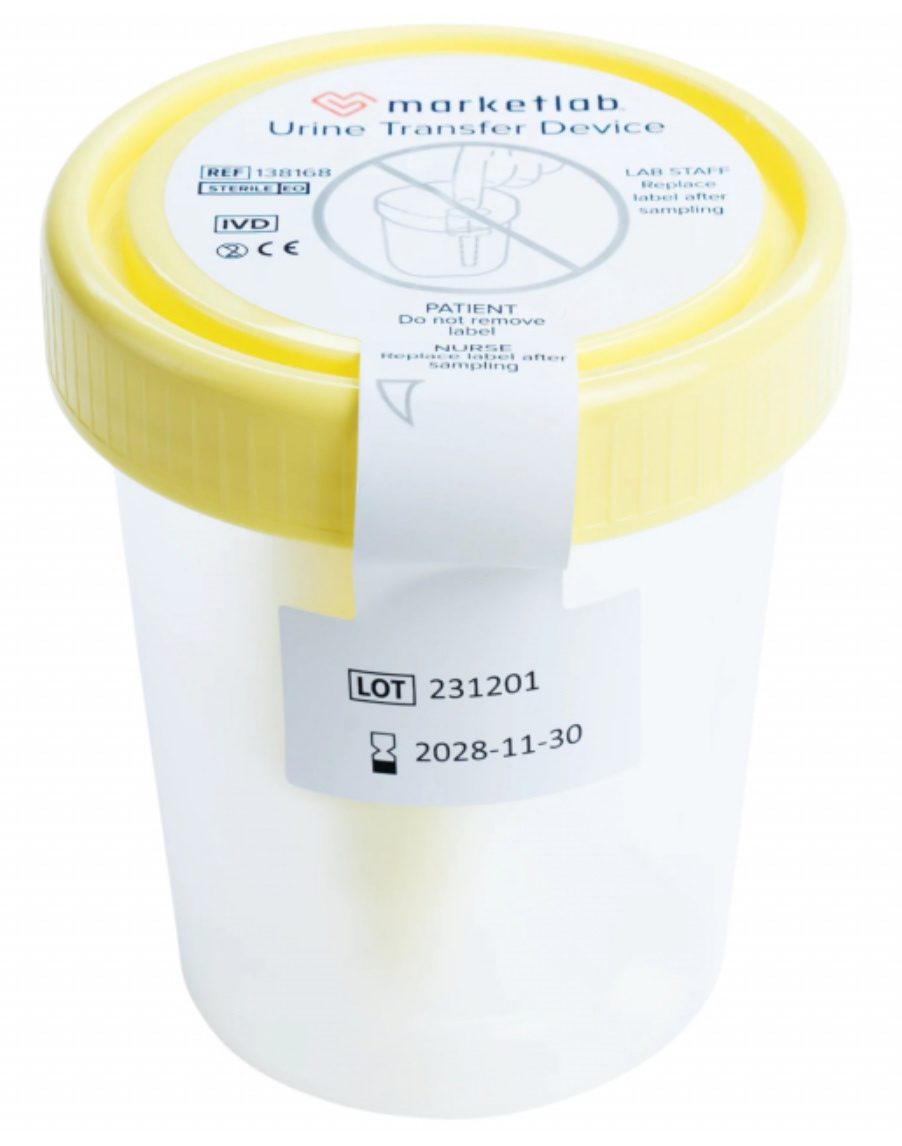
Urine Transfer Device label with dieline and tolerance indicated, shown alongside in-use photography on a specimen cup.
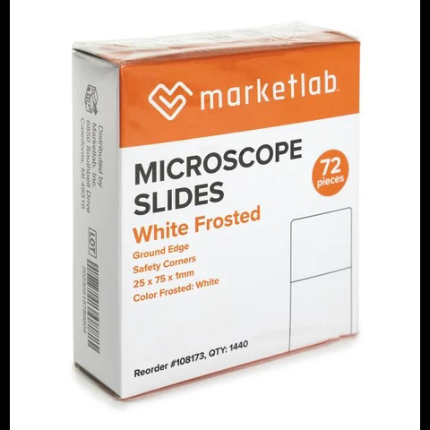

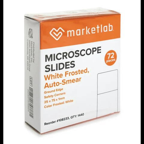
Microscope slide packaging developed to reflect a company rebrand across a private label product line. Designed for consistency across multiple slide types.
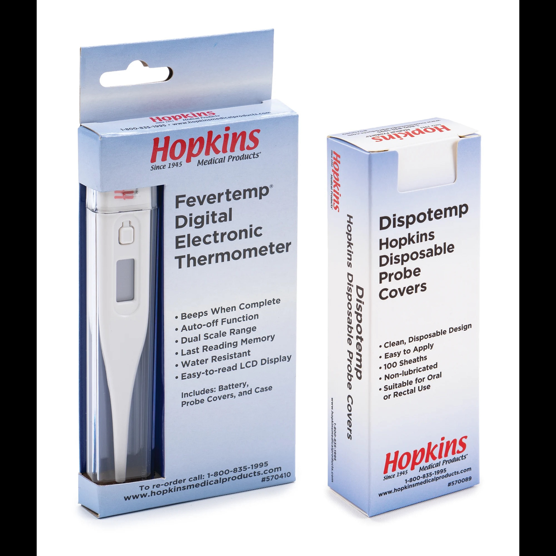
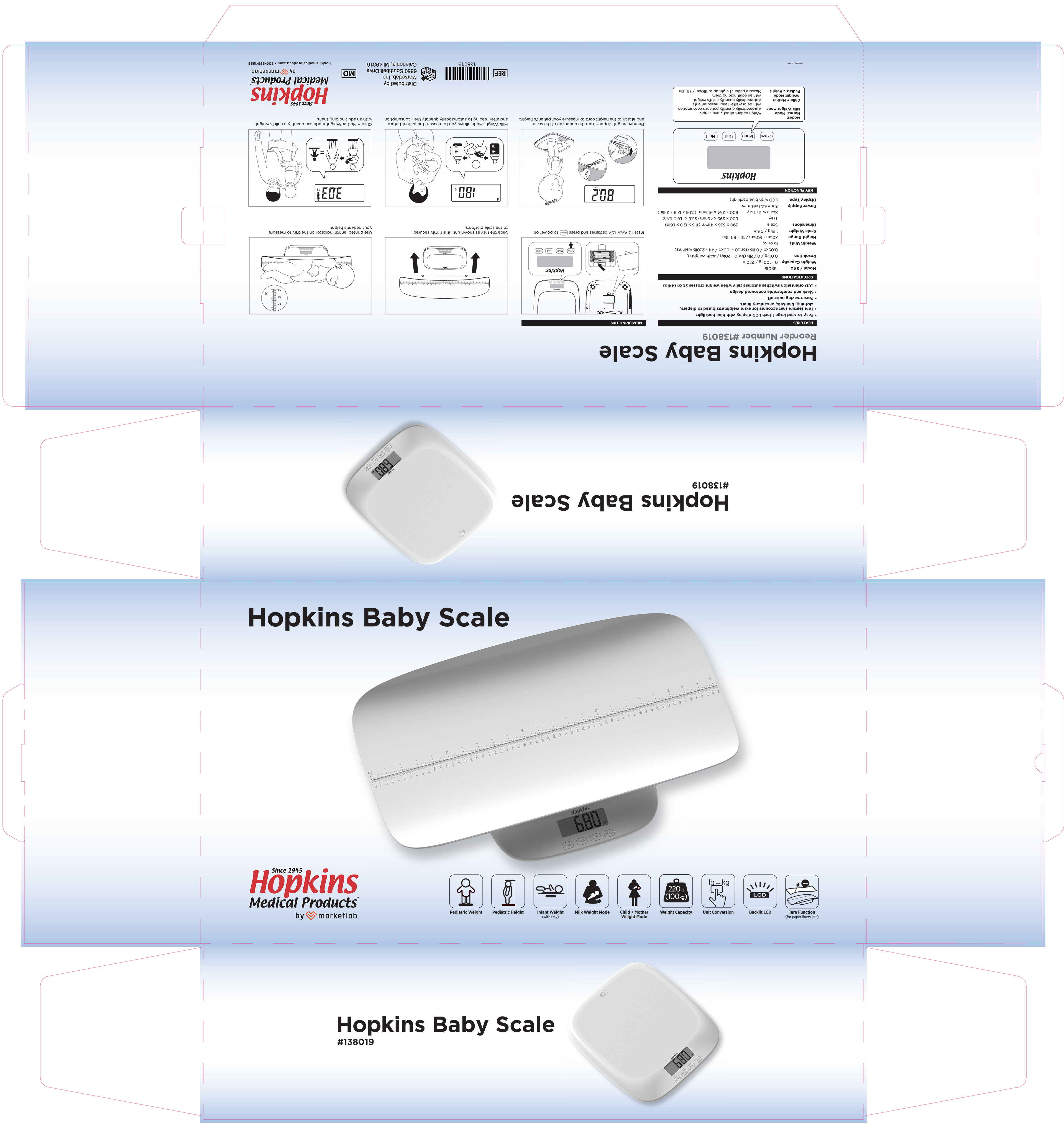
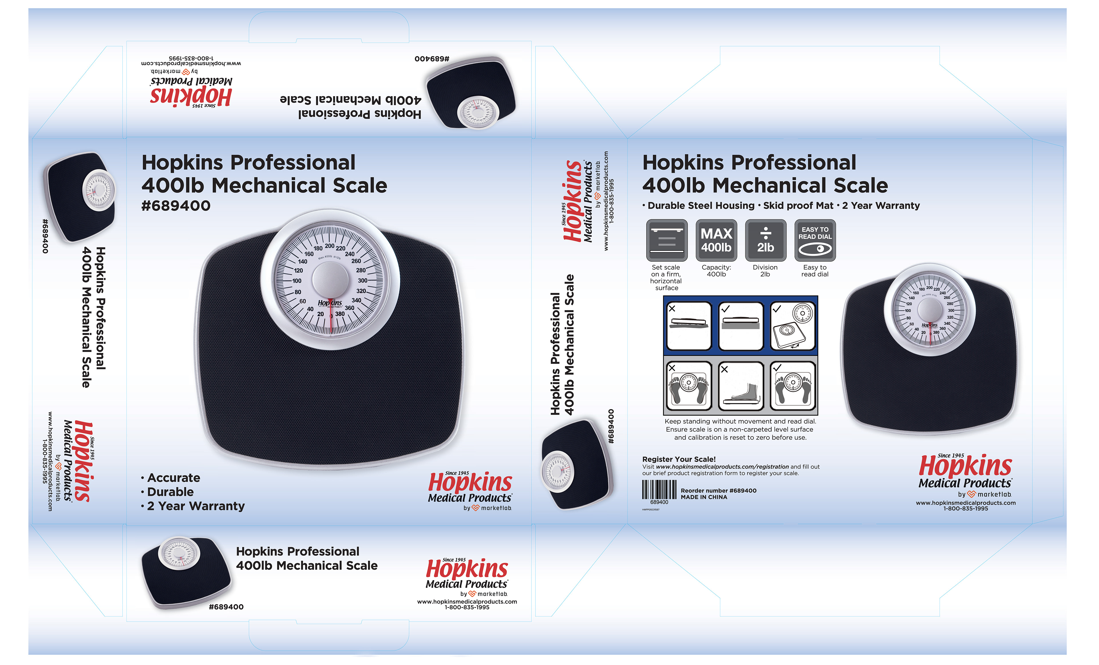
Led the packaging rebrand for Hopkins Medical Products post-acquisition by Marketlab. Defined a clean, approachable system that elevated the existing red and blue palette and introduced a signature blue gradient, forming the foundation of the packaging backgrounds across the line.
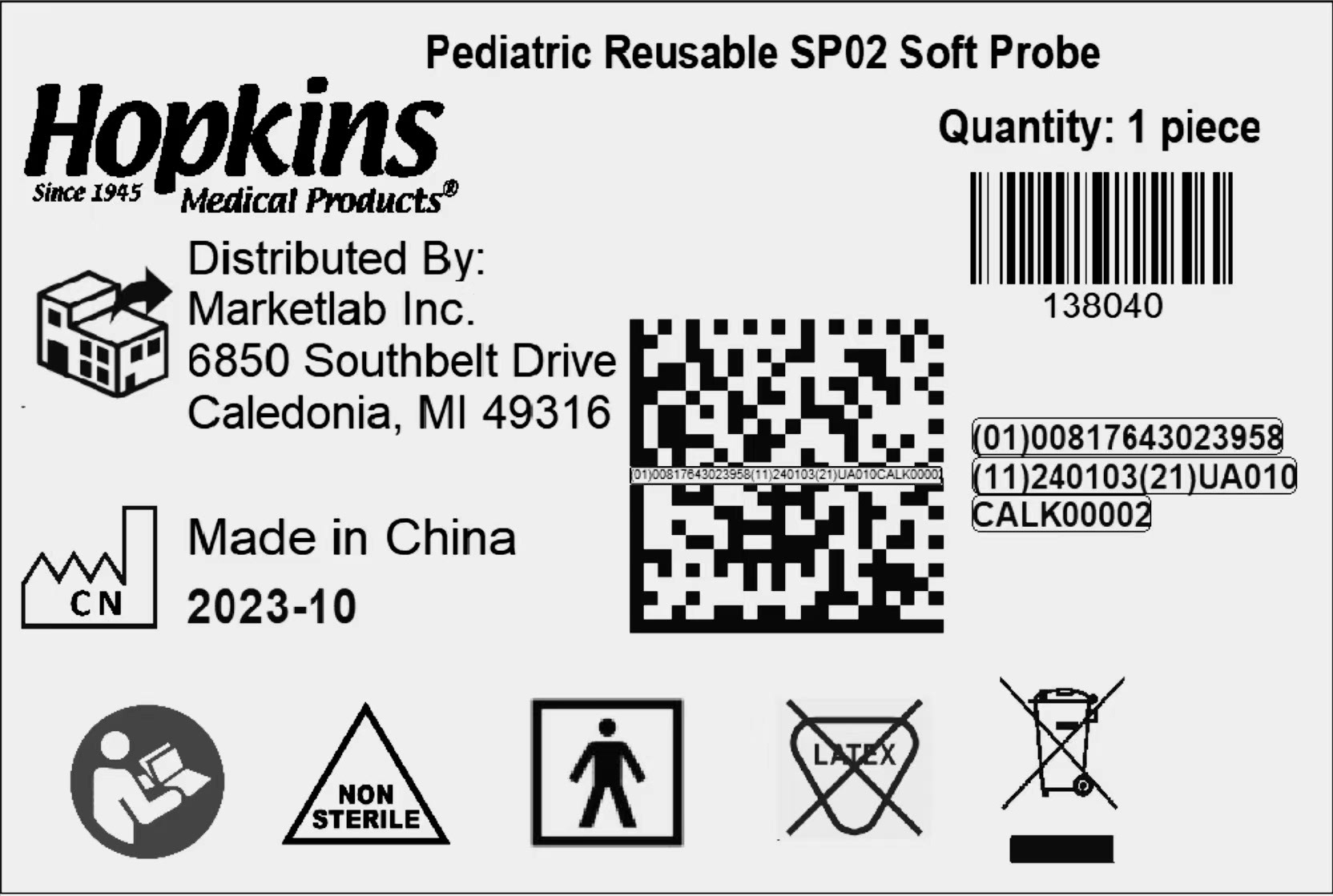
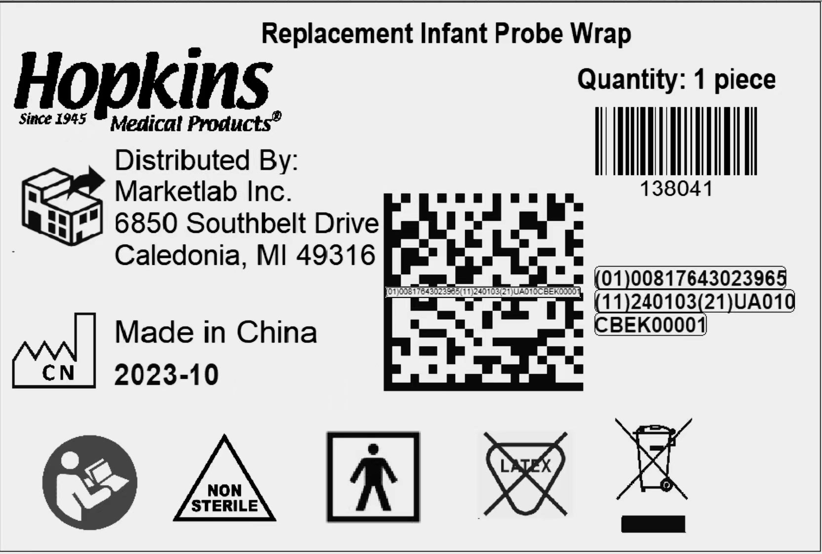
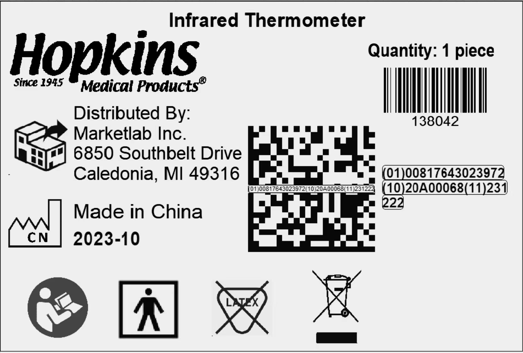
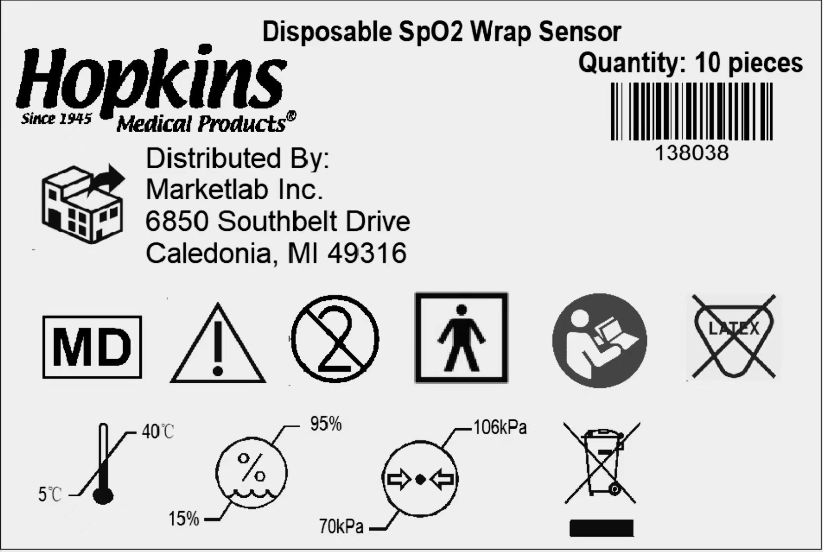
Created a system of adhesive product labels designed for direct-to-product application, maintaining consistency across the line.
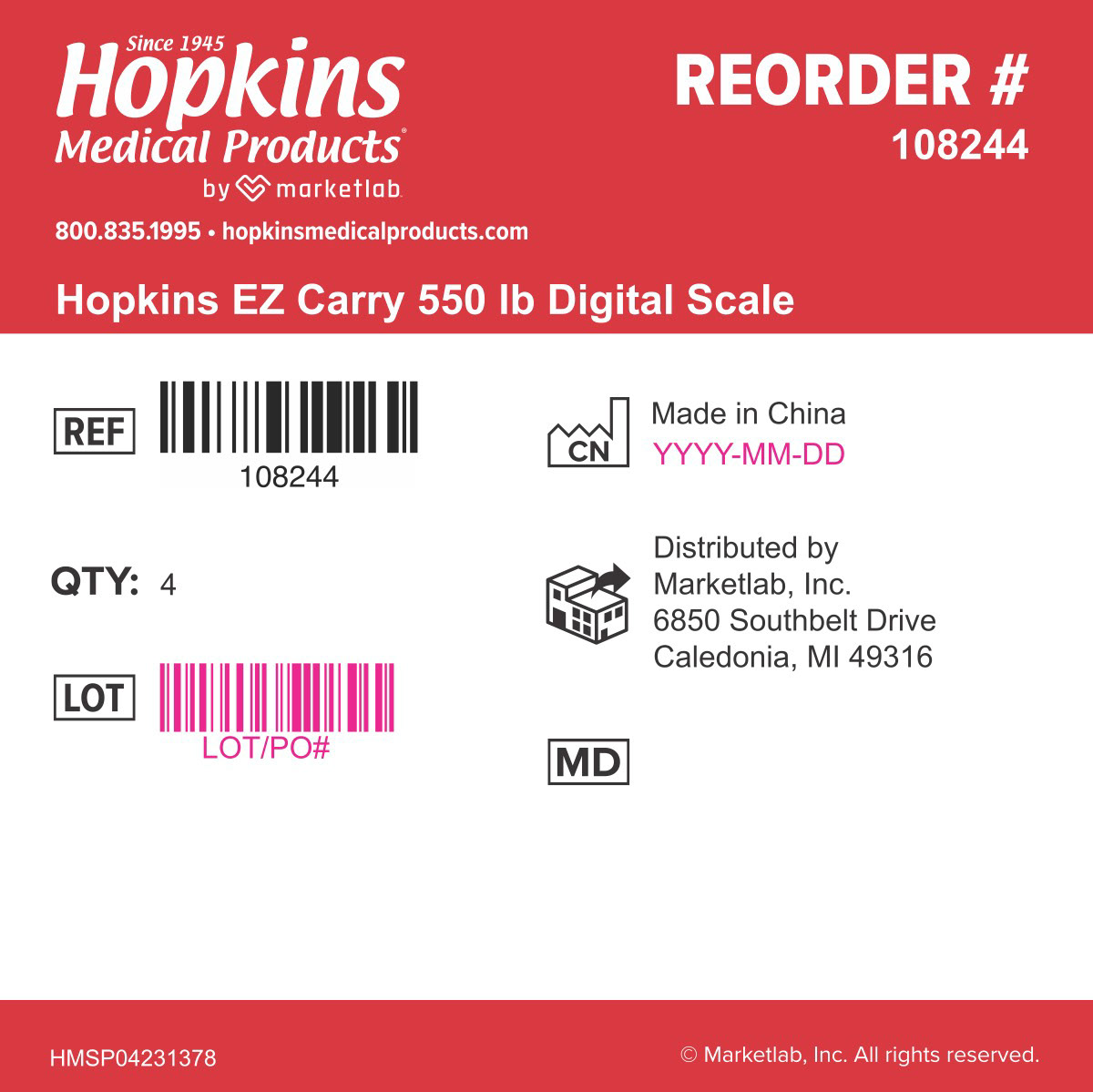
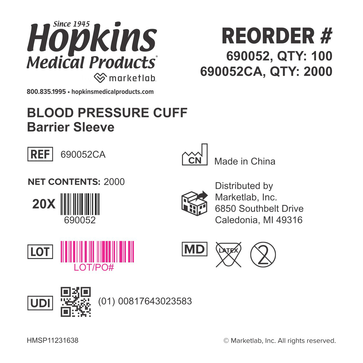
Created a cohesive labeling system for products and cartons, leveraging red as a consistent brand signal across applications.
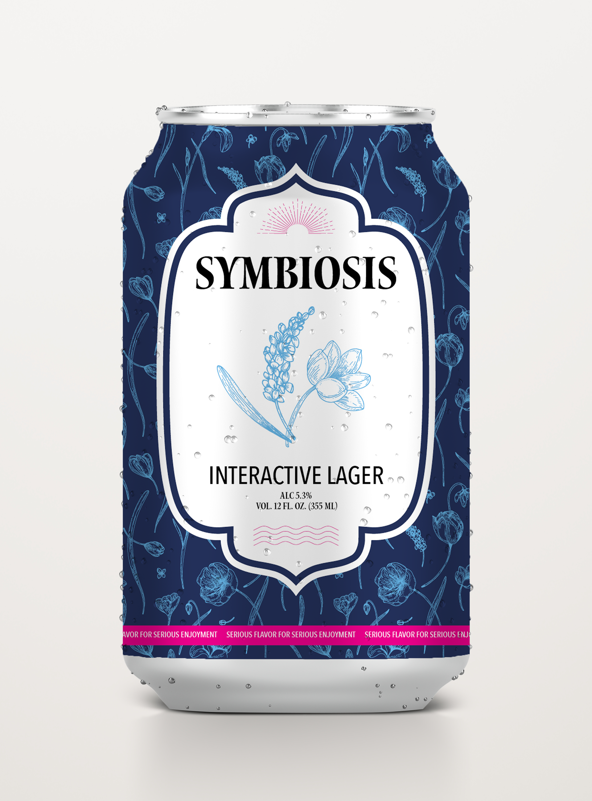
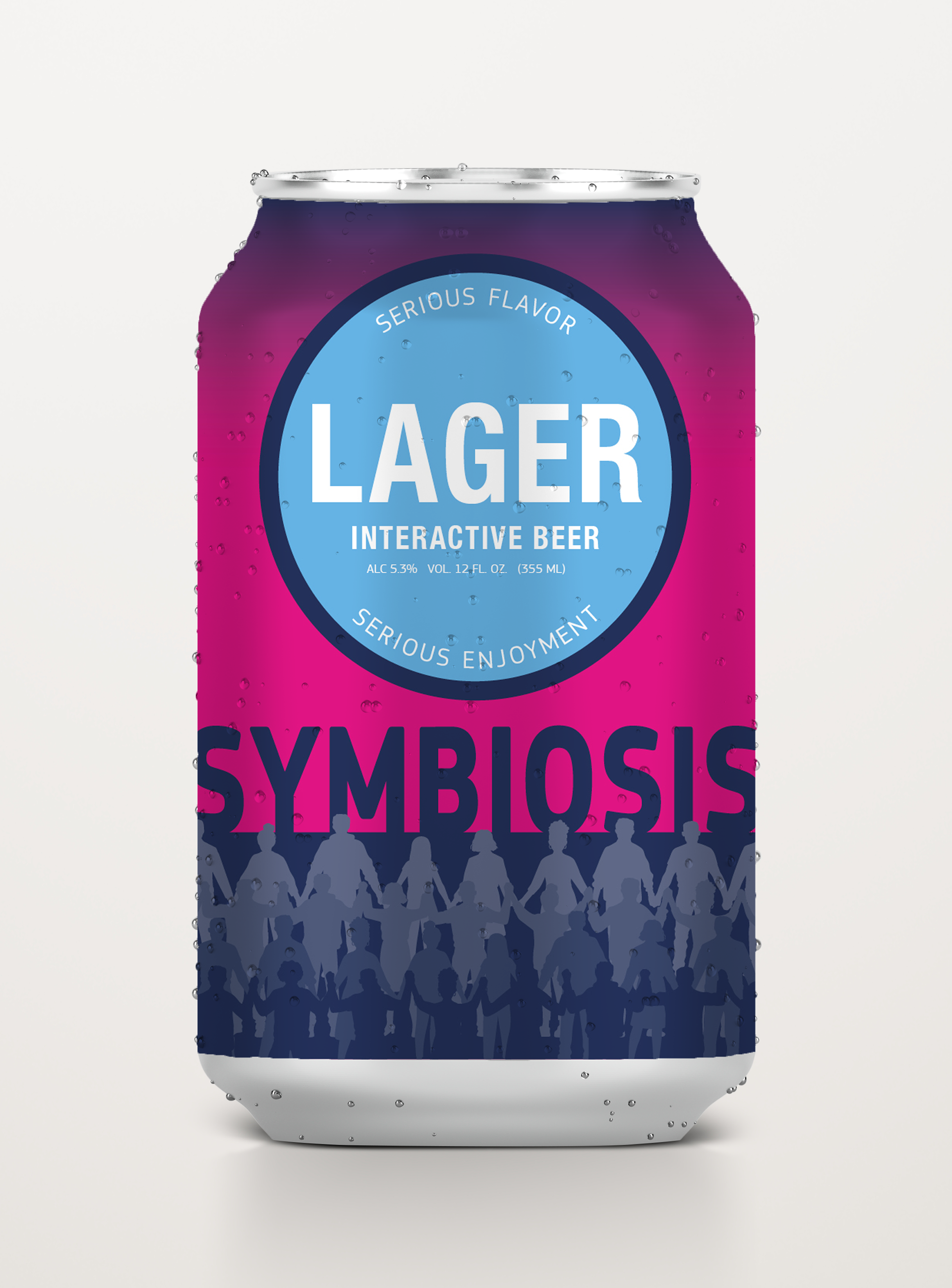
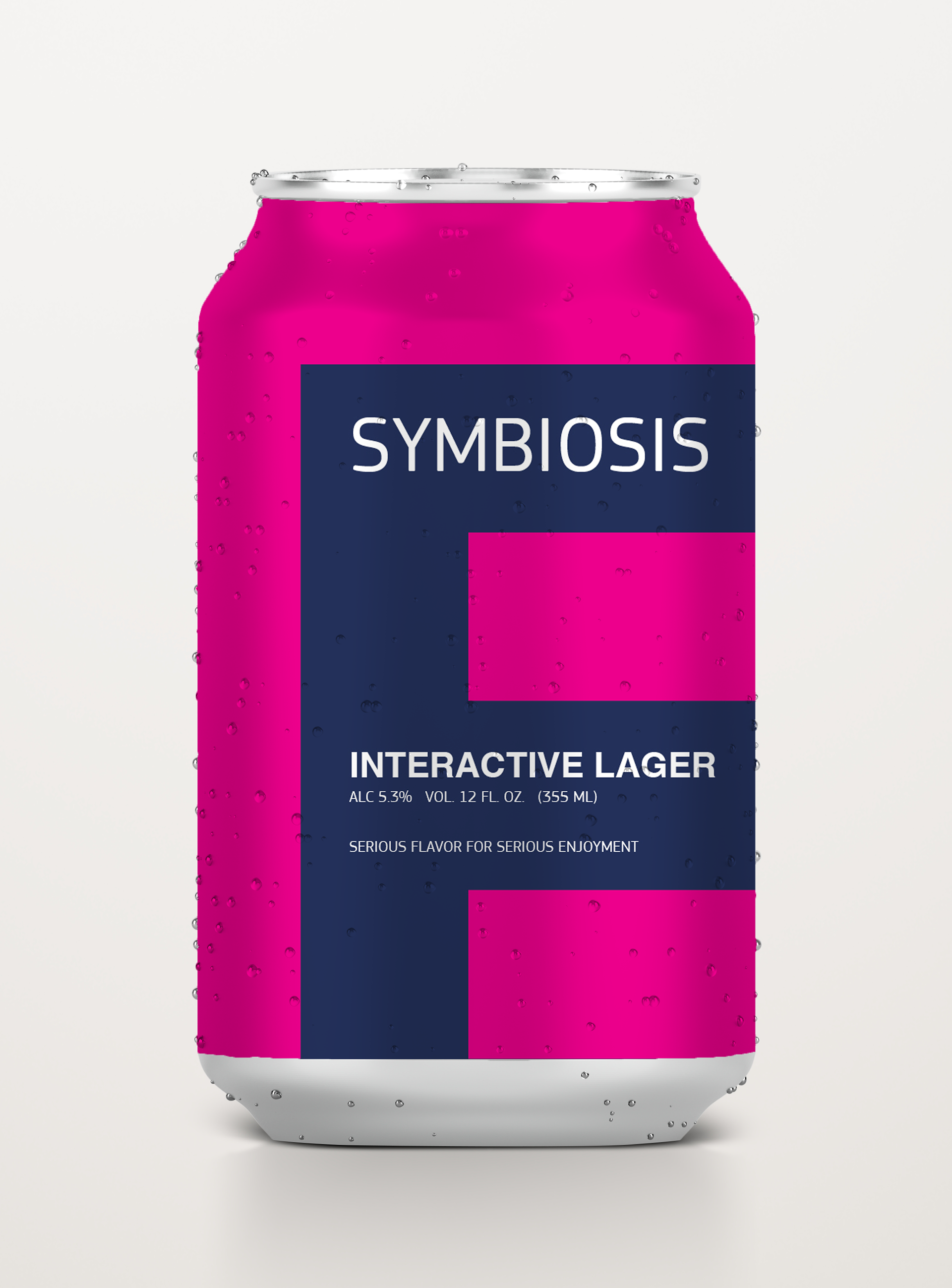
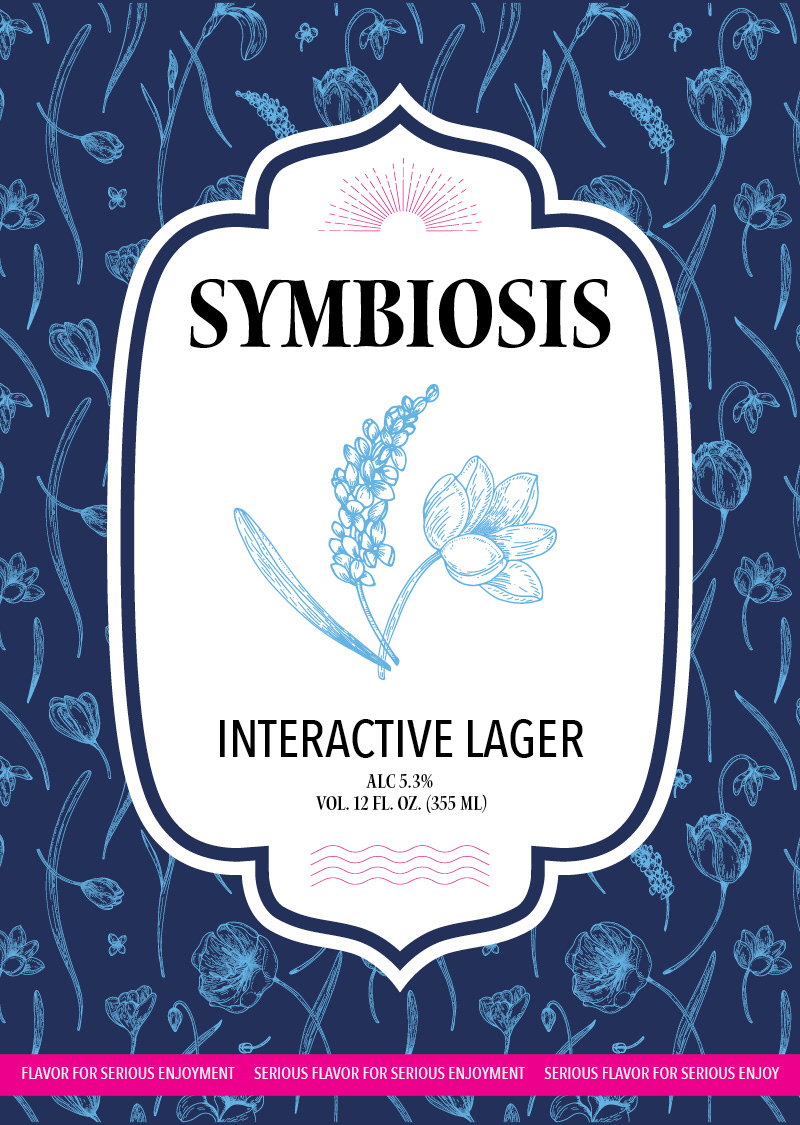
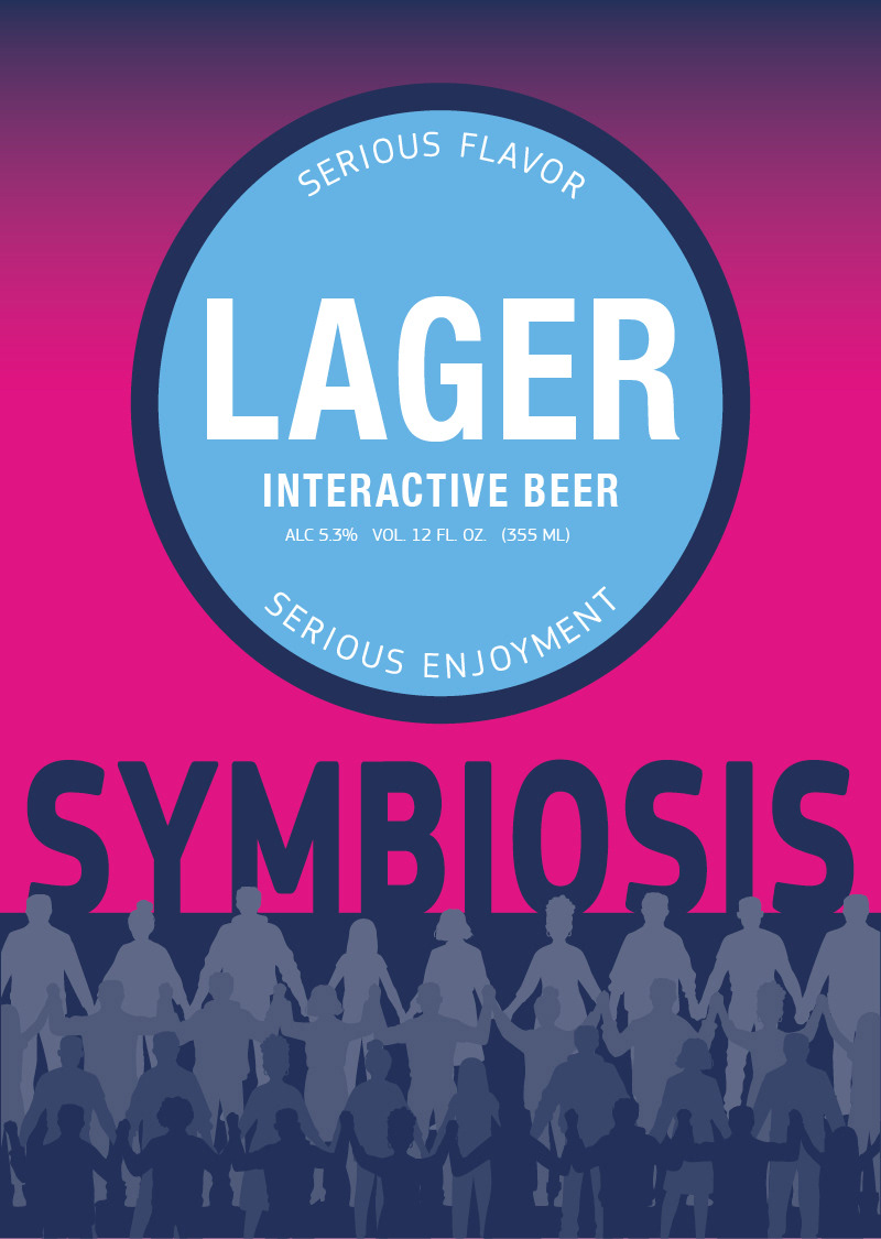
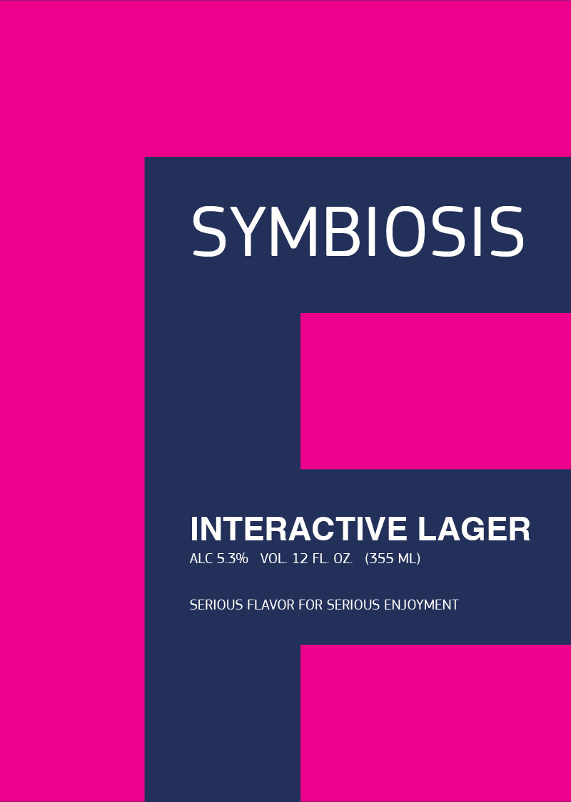
Created a series of beer can labels for Symbiote, exploring three visual directions: vintage, retro, and minimalist. The vintage direction draws from Holland, Michigan with a tulip pattern and nature-driven symbiosis cues. The retro direction emphasizes human connection through bold color gradients and shelf visibility. The minimalist direction uses an oversized logo mark as a graphic element, paired with modern typography and a stripped-down layout.